
ABOUT
-
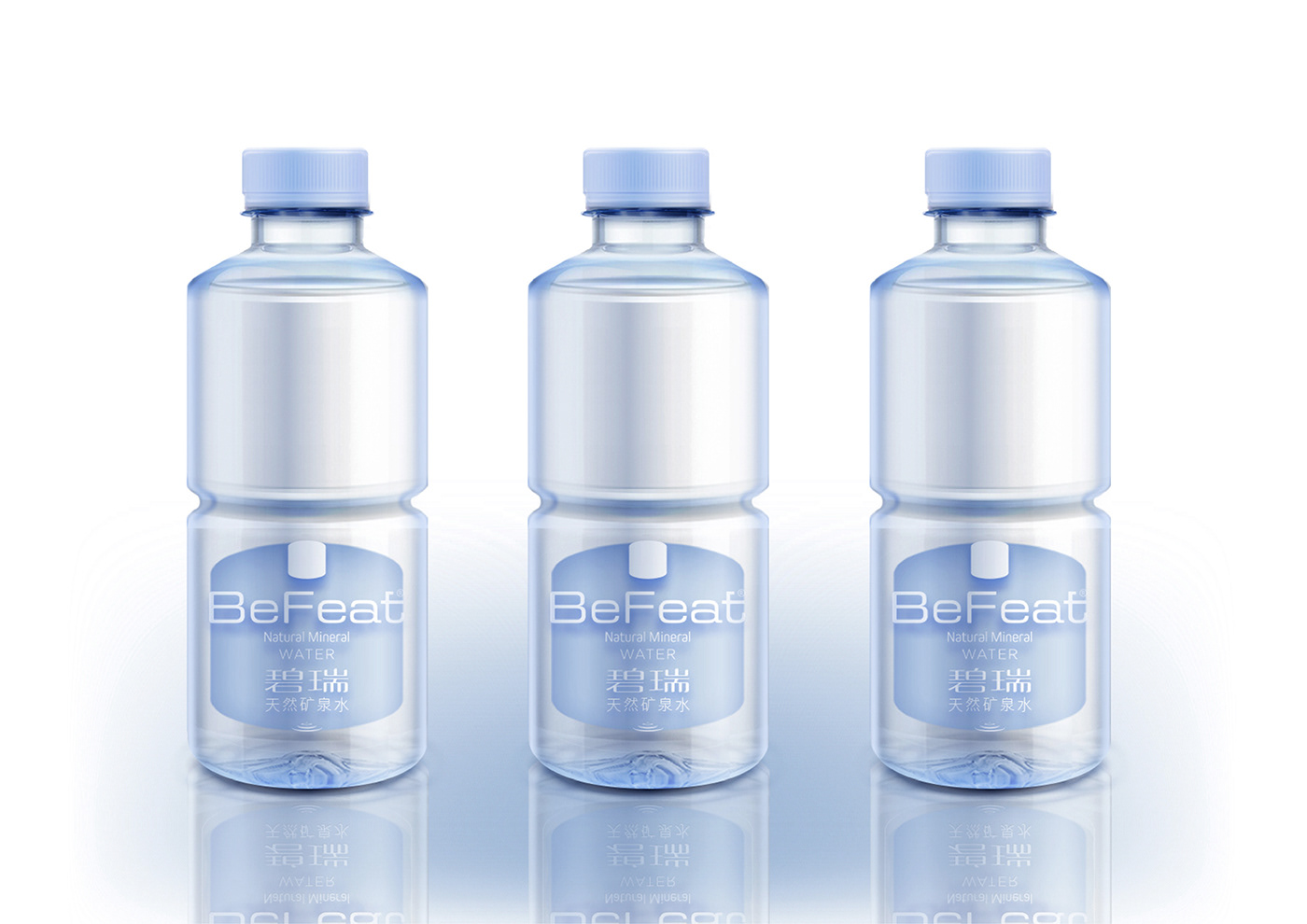
BeFeat Mineral Water is a high-end natural mineral water with high mineral content with the brand positioning of "Water Scientist".
The power of water is our abstract summary of BeFeat mineral water. In the packaging design, we directly take the rational and flat blue brand logo for three-dimensional imagination as an extension of the bottle design. The minimalist design conveys the concept of restraint and rationality, which continues the brand identity and implies the concept of BeFeat mineral water as the energy body of water in the bottle design. The division in the bottle body represents the superposition combination of energy blocks, which also makes the bottle body more convenient to hold.
Although there is only one specification as a sign, the product line with different capacity can also be superimposed and combined by different size of energy blocks. The design concept of bottle shape and packaging has established a differentiated and recognizable overall product and brand image for the whole BeFeat mineral water!


Client:BeFeat 矿泉水
Creative team:MoCAN美概品牌
Design in Charge:Royer 罗翊
Project:Branding / Packing
Project Complete:Dec.2019
©️ MoCAN

